Лендинг в инстаграм – новые клиенты за один день. Делаем лендинг для инстаграм. Шаблон для автоматического создания
Уже несколько лет Инстаграм является самой крутой и популярной площадкой для продажи товара. Ежедневно здесь покупают и продают сотни продуктов услуг. Ежемесячно сеть пополняется новыми людьми, которые готовы предложить что-то новое. Для привлечения клиентов именно к вашей странице воспользуйтесь новым инструментом – лендингом.
Что такое лендинг в Инстаграм и так ли он нужен?
Лендинг – это одностраничный аккаунт, только приспособленного для Бизнеса. Его задачей будет продать посетителям вашего профиля какой-то определённый товар, услугу или привлечь внимание к стороннему сайту. Думаем, вам не раз попадались на глаза странные, непонятные куски фотографий, а заходя на страницу, вы видите полную картинку – это и есть лендинг.
Лендинг нужен тем, у кого нет времени на то, что бы полноценно день за днем вести свою страницу в Инстаграм. Согласитесь, что это действительно очень сложно и забирает часы, которые можно потратить на что-то еще. Совсем иная ситуация с лендингами – разместили один раз и остается только заниматься привлечением новых покупателей.
Лендинг-страница нужна вам, если:
- Хотите привлечь внимание пользователей к своему основному каналу продаж, например, Ютуб, ВК или сторонний сайт, но у вас нет времени заниматься продвижением полноценно.
- Вы продаете один товар или предлагаете одну услугу.
- Вы хотите прощупать нишу и потенциальных покупателей – а нужен ли им ваш товар.
- У вас нет многотысячной аудитории, но вы хотите получать заказы.
- У вас ограниченный бюджет.
Как создать лендинг в приложении на телефоне?
Основное вы усвоили, теперь нужно ответить на вопрос как сделать лендинг в Инстаграме используя приложения на телефоне.
Все что вам понадобиться для создания страницы – фотография и приложение для ее нарезки на 9-12 частей.
Можно воспользоваться следующими программами:
- Giant Square;
- TRYPTpic;
- Tile Pic;
- PicSlit;
- Griddy;
- Grid Post.
У всех этих приложений похожая функциональность. Рассмотрим нарезку на примере Giant Square:

- запускаете программу;
- выбираете Giant Square;
- выбираете формат 9 фотографий;
- выделяете все галочки, чтобы они стали зелеными;

- загружает фото из галереи Camera Roll;
- настраиваете размещение фотографии;
- сохраняете либо в фотопленку, либо сразу в Инстаграм.
После этого остаётся главное – в правильном порядке загрузить картинки на страницу.
На каких онлайн-сервисах можно создать лендинг?
Как сделать лендинг в Инстаграме, если у вас нет доступа к приложениям на телефоне да и фотографии тоже нет? Воспользоваться услугами онлайн-сервисов.
- instalanding.ru. Принцип работы сайта прост:
- загружаете макет на сайт, если он у вас есть;
- режете на нужное количество частей -3,6,9;
- скачиваете полученные кусочки.
Если у вас нет готовой фотографии, то Инсталендинг поможет его создать за определённую сумму денег в короткие сроки.

- Picslice.com – отличный сайт, который поможет создать баннер за пару минут.Порядок действий следующий:
- зайти на сайт;
- загрузить фото, нажав на кнопку «Выбрать файл»;
- нажать «Upload»;
- далее сверху нажимать на «Slice picture»;
- задать параметры горизонтали и вертикали – 3х3;
- сгенерировать получившийся результат кнопкой «Generate»;
- сохранить картинку в нужном формате.
После сохранения переносим фотографии на устройство, с которого они будут выкладываться и загружаем в приложение.
Каким должен быть крутой лендинг для Инстаграма?
Как сделать в Инстаграме такой баннер, чтобы его заметили и главное, чтобы он приносил прибыль?
- Делайте лендинги, состоящие из 9 или 12 частей. Открывая вашу страницу, пользователь сразу увидит всю необходимую информацию.

- Один предложение – один лендинг. Помните, что в одном баннере не должно быть микса из разных товаров или услуг.
- Переведите страницу на бизнес-аккаунт.
- Добавьте на аватарку фотографию с вашим логотипом или продаваемым товаром.
- Приведите в порядок шапку профиля – дайте короткое описание того, что вы продаёте, разместите ссылку на внешний сайт, в котором можно ознакомится с предложением подробнее, укажите контакты.
- На самом лендинге не забудьте указать контактную информацию.
- На баннере все должно быть лаконично – никаких лишних деталей: изображение товара, короткое описание, цена и как купить.
Заключение
Инстаграм постоянно развивается и предлагает своим пользователям новые возможности для ведения бизнеса. Освоив фишки сервиса можно продвигать свои услуги и товары, привлекать больше покупателей и получать прибыль.
Сегодня разберемся в том, как сделать лендинг в Инстаграм, а также что вообще такое этот лендинг, ведь если вы являетесь пользователем социальной сети Инстаграм, то наверняка на вас подписывались аккаунты, отличительной особенностью которых является размещение в профиле ограниченного количества фотографий (чаще всего 9), являющихся фрагментами общего изображения.
Лендинг в Инстаграм: что это такое?
Описанные выше аккаунты и называются лендингами (от англ. landing page — посадочная страница), то есть страницами, предназначенными для привлечения на них клиентов и конвертации их в покупателей товаров и услуг.
В Инстаграм такие страницы часто создаются для привлечения клиентов и перенаправления их на основной аккаунт.
К примеру, у магазина существует основной профиль с размещенной в нем информацией обо всех товарах, и еще несколько аккаунтов-лэндингов с информацией о каком-то одном товаре из магазина, но с призывом перейти в основной профиль для ознакомления с полной информацией и ассортиментом. Такую технологию удобно использовать при массфоловинге — автоматизированной массовой подписке на аккаунты потенциальных клиентов с целью привлечения их внимания. То есть берется несколько таких лендингов и через специальный сервис настраивается массфоловинг по целевой аудитории. Меняя настройки массфоловинга для каждого отдельного лэндинга, можно отслеживать эффективность привлечения клиентов каждым таким лэндингом.
Кстати, если вам нужен хороший сервис продвижения Инстаграм в т.ч. для массфоловинга, то посмотрите про один крутой сервис.
Для примера приведу скриншот одного из своих аккаунтов, который, как раз и является лэндингом:
Главным преимуществом лэндинга является то, что создав его единажды, вам больше не нужно добавлять фотографии в профиль, т.е. не нужно тратить время на его сопровождение: создали, заполнили профиль, добавили несколько фото и все — можно ставить на автомат в сервис массфоловинга!
Что такое лэндинг в Инстаграм и для чего он нужен разобрались, переходим к рассмотрению вопроса как сделать посадочную страницу в Инстаграм.
Как сделать лендинг в Инстаграм
Чтобы сделать из профиля Инстаграм лэндинг нужно в первую очередь соответствующим образом заполнить профиль. Тут все индивидуально и зависит от целей, которые вы преследуете.
Функция моего рассматриваемого профиля — переадресация трафика на основной профиль компании, поэтому аккаунт заполнен соответствующим образом.
Для редактирования профиля щелкаем по кнопке:

И заполняем следующие поля:

Теперь нужно загрузить полученные фрагменты изображения в порядке, начиная с нижнего правого и заканчивая верхним левым. При загрузке каждого фрагмента необходимо добавлять описание, побуждающее посетителя совершить конкретное действие (перейти в основной профиль, перейти на сайт в описании профиля, позвонить по телефону, оставить заявку и т.д.):

Также я советую к каждому фрагменту добавлять геолокацию, причем отмечать какие-либо характерные места, которые часто посещают ваши потенциальные клиенты. Кроме того, если функция вашего инстаграм лендинга заключается в переадресации клиентов на какой-то другой профиль Инстаграм, то на каждом фрагменте добавляемого фото стоит отметить этот профиль (функция отметить пользователя):

В зависимости от ваших потребностей на лэндинг можно добавить кнопки для связи с вами. Об этом я писал в .
Проделав все описанные действия, вы получите собственный лендинг в Инстаграм.
Успехов вам в продвижении вашего бизнеса!
Напоследок небольшая рекомендация от меня. Если вам нужно раскрутить аккаунт в Инстаграм, то обратите внимание на сервис Zengram . С ним вы создадите движуху в своем Инстаграм и сможете получить много подписчиков, лайков, комментариев. Пользуюсь сам и вам советую! Скидка 15% на все пакеты продвижения по промокоду exprom_15 . Регистрируйтесь! Обзор сервиса по .
Активные и опытные пользователи социальной сети с большим восхищением относятся к профилям, которые . А все потому, что чем-то обычным уже никого не удивишь. Но еще большего восторга заслуживают страницы компаний, использующих такой инструмент, как лендинг в Инстаграм.
Инсталендинг: модно или действительно эффективно?
Instagram – это настоящее раздолье для тех, кто хочет быть оригинальным и креативным. Одной из интересных фишек платформы является создание одностраничного сайта. Иными словами, лендинг пейдж (в англоязычной версии – landing page Instagram).
Рассмотрим лендинг в Инстаграм, пример:

И в этом случае легко спрогнозировать возможные вопросы среднестатистического человека. С какой целью это делается? Есть ли в этом хоть какой-нибудь смысл? Ведь для подобных идей существуют сайты. Зачем перетягивать все это в Инстаграм? Вопросов действительно много, они различные, но на них достаточно дать один лишь ответ.
Не все так сложно, господа. Весь секрет заключается в том, что пользователи социальных сетей не любят переходить по ссылкам на сторонние ресурсы. Им бесполезно рекламировать что-либо, поскольку отклик слишком мал. Вспомните себя. Охотно ли вы покидаете любимое уютное местечко ради просмотра коммерческого контента? Скорее всего, нет. И так почти с каждым. Даже популярные бренды и торговые марки не всегда заполучают желаемое внимание. Что уж говорить о начинающих компаниях?
То есть, порог отказов слишком высок. Это мешает продвигать нужный продукт или ресурс. А создание аналогичного сайту профиля в Инстаграм – хитрость, заслуживающая уважения. Это действительно разумно и действенно. Юзеру не нужно упускать из виду знакомый интерфейс и покидать место своего пребывания. Инстаграммер просматривает информацию непосредственно в социальной сети. И все по итогу остаются довольными. А если не хочет, то не смотрит, и спокойно возвращается к прежним делам.
Стратегии продвижения:
- Массфолловинг. С данной страницы владелец аккаунта настраивает массовую подписку на пользователей. В большинстве случае у юзеров Инстаграм срабатывает самое обычное любопытство. «Кто на меня подписался?». Он переходит в профиль и просматривает привлекательную и грамотно структурированную страницу.
- Публикация постов с активными ссылками. Вторая возможная стратегия – это призыв «узнать подробнее» для своих подписчиков и гостей странички. То есть, размещенная заметка содержит лишь часть нужной информации, но к ней прилагается ссылка на продолжение. Оно, разумеется, будет размещаться по указанной ссылке.
Как повысить эффективность работы в Instagram
- Перевод страницы в бизнес аккаунт;
- Размещение контактов в «шапке» профиля;
- Размещение контактов на самих фотографиях (в постах).
Как сделать лендинг в Инстаграм?
Поговорим о следующем: инстаграм лендинг как сделать самому. На просторах «всемирной паутины» не так уж много толковых инструкций относительно создания лендинга в данном формате.
Постараемся объяснить просто и доступно.
Необходимые инструменты
Подготовительный этап работы:
- Выбор «отлежанного» аккаунта в Instagram, во избежание его блокировки. Для этого можно использовать личный профиль. Если такового нет, воспользуйтесь сервисом Install-shop ;
- Далее понадобится сайт в виде изображения. Если не знаете, как его создать, поищите мастер-классы в сети;
- Сервис для разрезки изображений. Существуют абсолютно бесплатные ресурсы, позволяющие продвинуться в нужном направлении и создать инсталендинг онлайн.
Основной этап работы:
- С дизайном разобрались. Самое время уточнить размеры изображения. Ширина фото: 1920 или 3240 пикселей. Высота: произвольная (но должна делиться на ровное число).
- Выбранное фото необходимо загрузить в сервис. Выберите количество частей (3 по ширине + целое число по высоте). Перейдите к обработке изображения.
- Загрузите итоговый файл, кликнув по кнопке «Download». Он сохраниться в виде архива, поэтому в дальнейшем потребуется разархивировать файл.
- Поочередно загрузите фотографии на страницу Instagram в обратном порядке. Не превышайте лимит в 50-80 фотографий. Система может временно заблокировать данное действие для пользователя. Если изображений больше 100, посвятите этому несколько дней.
- Бинго! Лендинг пейдж в Инстаграм создан! Вы справились с этой задачей.
Как загружать массово такие аккаунты?
Самостоятельно оформить лендинг пейдж под силу каждому желающему. Для этого потребуется не так уж много времени и совсем немного терпения. Но как быть в том случае, если таких страниц много, и всех их нужно заполнить рекламным контентом?
Хотите сэкономить время и обойтись без грандиозных вложений? Тогда вас выручит популярный сервис Instap . Программа позволяет и разрезать, и загружать изображения массово. За эту услугу придется заплатить небольшую сумму денег. Если есть необходимость одновременно заниматься несколькими страничками в Инстаграме, это получится выгодно. Но разовое использование приложения нецелесообразно.
Заключение
Создание инсталендинга может преследовать различные цели. В зависимости от масштабности страницы может варьироваться сумма вложений. Полноценные и раскрученные инстаграм-сайты могут обойтись его владельцу от 3 до 6 тысяч рублей. Более скромные проекты не потребуют больших финансовых вливаний. При желании можно уложиться в 500 рублей.
Мне нравится 0
Last updated on August 28, 2018 by in ,
Instagram continues to move up the social media ladder. From a niche site for amateur photographers and a few filters to one of the top used image-sharing platforms, the cannot be ignored by marketers looking to expand their audiences. And, as we continue to march toward an app-first online experience, mobile continues to outpace desktop in traffic. Mobile-first sites such as Instagram will continue to reap the benefits, meaning your ads have greater potential — and create higher ROI if you combine ads with an Instagram landing page.
What is an Instagram landing page?


(You’ll notice below we’ve displayed the ad before the landing page to show you the full sequence an Instagram user would experience.)
Keep in mind, for shorter Instagram landing pages, we’ve shown the entire page. However, for longer pages, we only displayed above the fold. You may need to click through to each landing page to see some of the points we discuss. Also, some of the brands listed below may be A/B testing their page with an alternate version than the one displayed below.
1. Wall Street Journal


- Both the ad and landing page headline use , and appeal to the emotion of a new administration in the White House.
- The indicates which plan is selected and tells visitors to look below for more specific information on the selected plan.
- Bulleted copy makes it easy for visitors to scan the main points of the page and their selected subscription.
- “ACT NOW” appeals to the urgency of both the offer and staying informed right away.
- Being upfront with pricing and offering discounts provides a psychological boost to visitors.
- The absence of navigation links doesn’t allow a user to exit without converting or closing the page.
- “You can cancel anytime” puts visitor’s minds at ease that they will not be locked into a long-term contract.
- The Wall Street Journal logo is linked, but it doesn’t take the visitor off the page — it reloads the page. This is a bit misleading and could frustrate visitors into thinking they can navigate to the WSJ website, but are stuck on this page. In this situation, it’s best to unlink the logo and avoid confusion altogether.
- There are a number of different options on this page. Choosing between 3 ways to receive the news and 3 different plan lengths can be too much for a single landing page. The Wall Street Journal could try testing a click-through page that leads to a pricing page with all of these options.
2. Lending Club


What this landing page does well:
- The clipped credit card is an excellent hero image that doubles as a way to convey the emotional relief of getting out of debt.
- The headline speaks to the individual and plays on the desire to save money.
- A low-friction form with only a few fields and a contrasting CTA button makes conversions easier. It’s also , drawing immediate attention. The message about not impacting reduces anxiety as well.
- helps visitors’ eyes reach the form faster.
- Certificates and badges from the BBB and others help establishes trust.
What could be changed and A/B tested:
- The logo links to the website, giving visitors an exit that doesn’t result in a conversion.
- Breaking the headline into a headline and a subheadline. The headline could read: Save thousands with the subheadline reading: Pay off your high interest debt with a low, fixed rate loan.
3. Syracuse University


What this landing page does well:
- The reduces friction because it lets visitors know how many steps are involved in the signup process and that it “will only take a minute!”
- The secondary headline mentions they are Ranked No. 18, establishing credibility for the program.
- Very little text above the fold keeps the visitor focused on the important areas of the landing page, such as the form and the hero image.
- Bulleted copy highlights the main advantages of the Syracuse Online MBA program.
What could be changed and A/B tested:
- The form headline, “Learn More” could be tested against something more intriguing and benefit-oriented like, “Higher Education Starts Here.”
- “10% complete” seems like the visitor is still a long way from being finished. Syracuse could test larger starting numbers or fewer steps to prevent visitors from becoming discouraged before they begin.
- The page seems unbalanced with too much white space.
4.


What this landing page does well:
- The message of the page matches perfectly to the ad.
- The webinar presenters are shown, giving a human connection to the page and establishing their authority. They could be aligned differently for better aesthetics, though.
- Minimal copy clearly explains what a viewer will learn in the webinar.
- A simple form reduces friction.
What could be changed and A/B tested:
- The “landing page” is a page on the website with too many distractions and places for a user to exit that aren’t the form. Removing the navigation and footer would be a good start.
- The CTA button is the same color as the only other CTA on the page, which can still get conversions, but to something other than the webinar.
- There are no images on the page until well below the fold for the webinar presenters. Try adding an image that shows digital marketing in action, the ebook that is mentioned, or the presenters speaking on a webinar.
5. Autopilot


What this landing page does well:
- The copy above the fold is simple and straightforward.
- The word “Free” lets visitors know the the report won’t cost a dime.
- The landing page image matches closely with the ad.
- A two-field form with a CTA color that stands out encourages conversion.
- The author bio section provides more information on Guy Marion and his qualifications to write the report. Plus, his headshot is included, which adds human appeal to the page.
- The hyperlinked CTA button at the bottom of the page directs visitors back to the form above the fold.
- Overall, the page is very well-balanced with white space and persuasive elements.
What could be changed and A/B tested:
- The logo is hyperlinked back to the Autopilot website, giving visitors an opportunity to exit without converting.
- The copy could be written in the first person to speak, especially on the CTA button, i.e. Send Me the Report. Even second person speaks to the visitor personally.
- The chat bubble in the bottom-right corner acts as a distraction because when you hover over it, it promotes a different offer. Once you click that new offer, you’re taken away from this page.
6. Influitive
Influitive is running an A/B test on the ads themselves, which we at Instapage highly encourage. Since Instagram only allows advertisers to use pre-made calls-to-action that they provide, Influitive is testing whether adding a CTA that looks like a button will have an impact on ad clicks. While the color makes the image pop and attracts eyes to the CTA, it would be interesting to see whether that is enough to offset the frustration of not being able to click it.


What this landing page does well:
- The arrow directional cue in a contrasting color directs eyes to the form.
- The CTA button color stands out and matches the directional cue.
- The cover of the ebook gives visitors a look at what they are getting.
What could be changed and A/B tested:
- Influitive’s logo is hyperlinked, which gives visitors a way off the page before they even have a chance to evaluate the offer.
- Lots of text make this page more of a chore to read than it needs to be. It could be reduced to make the page more visually appealing. Also better spacing from the image would make things more aethstetic.
- The form has many required fields. This can be good if Influitive is looking for Sales Qualified Leads, but for an Instagram ad, it might be too much.
- Both the form headline and CTA copy leave much to be desired. Test first or second person (my or you) and a benefit.
- The page is not balanced at all because it seems like the company wanted to squeeze everything above the fold. The copy is too close to the image and the form with way too much empty space at the bottom of the page.
7. Washington State University


What this landing page does well:
- The Washington State University logo is not linked, which helps keep visitors on the page.
- The headline appeals to the visitors’ emotions and desire to get ahead in the business world.
- The multi-step form clearly shows there are 3 steps, reducing friction to getting started.
- Highlighting their #27 ranking helps establish WSU’s online MBA program as highly credible.
- The accreditation and ranking badges establish authority and credibility.
- The hand acts as a visual cue pointing in the direction of the form and CTA button.
What could be changed and A/B tested:
- The CTA button is not noticeable at first glance so it could be much larger.
- The CTA color doesn’t contrast with the page in any way.
- The CTA copy could be more specific at each step in the signup process. “Take Me to Step 2” and “Take Me to Step 3” would be more encouraging than the current copy.
- The footer links provide an exit for visitors that doesn’t result in a lead.
- WSU could test different copy that speaks directly to an individual. The current copy speaks to a large, somewhat ambiguous group, not the visitor personally. Try a version that adds “you” and “your” to the copy.
- The 2015 copyright should be updated. If this page is two years old, what else could potential students question about the program and it providing a high-quality education?
8. WordStream


What this landing page does well:
- The ad and landing page are expertly aligned, from images to ad copy.
- Bulleted copy states exactly what you’ll receive from the guide.
- The copy speaks to the visitor directly, using second person (you and your).
- The page has great flow, allowing a visitor’s eyes to drift from headline to hero image to scrolling down to find the form.
- The hero image links saving time and money to the words “Save Money” by making them all green.
- There is no wasted space on this landing page — it’s well balanced and doesn’t include any extraneous content that would distract from the checklist download.
What could be changed and A/B tested:
- The 8-field form creates a lot of friction because it requests a lot from visitors. Are company name, phone number, and website necessary for the checklist?
- Too many colors makes this page more difficult to process than it needs to be.
9. Wealth Dynamics


What this landing page does well:
- The page, copy, and form are all short and to the point, reducing friction.
- “Free” is used to convince visitors to download the e-guide.
- The 3-field form doesn’t take much for visitors to convert.
- The video images at the bottom provide a “bonus” incentive to download the ebook.
What could be changed and A/B tested:
- Header links provide too many options for visitors to leave before considering the e-guide download.
- The headline uses second person, but doesn’t really say anything. Test something that excites and offers a benefit, such as “Find Your Entrepreneurial Flow.”
- The CTA button, while on-brand, blends in with the rest of the page.
- The CTA copy is uninspiring. “Download” is you can use to generate conversions. Try a more compelling action verb in the first or second person. “Get Your Genius Guide Now!” could increase the number of conversions.
- The checkbox for email updates is pre-checked, which is a sneaky way for Wealth Dynamics to add people to its email list — especially if visitors don’t opt-in to their list voluntarily.
10. Flywheel


What this landing page does well:
- The hero image matches the ad perfectly.
- “Free” is used in the headline, helping draw immediate attention and generate even more interest in the ebook.
- The iPad remains static along the side as a visitor scrolls but the image scrolls to the different chapters, bringing the page to life.
- The CTA button above the fold uses an anchor tag that, when clicked, send visitors to the form below the fold.
- Customer testimonials, with name and affiliation, add trust and credibility.
- The chapter-by-chapter summary helps tease visitors with more information and to download the ebook.
What could be changed and A/B tested:
- Flywheel’s logo above and below the fold are hyperlinked off this landing page. “Get Flywheel” is also linked at the bottom of the page, which acts as a CTA because it uses an action verb but takes attention away from the ebook.
- The “Download” CTA copy isn’t compelling. Instead, Flywheel should try testing more inspiring action verbs and including a benefit of downloading.
- The page headline is the same as the ebook title. This is okay, but the headline is an opportunity to grab attention with an emotional appeal, which the copy does. Take every opportunity you have to grab visitors’ attention.
11. Grow


What this landing page does well:
- The arrow acts as an explicit directional cue that sends visitors eyes to the form right away and when they finish scanning the text.
- The form is encapsulated with a blue-box outline, which draw attention right away.
- Hero images give a glimpse inside the software.
What could be changed and A/B tested:
- The logo is hyperlinked to Grow’s homepage.
- Each bullet point has a lot of text. Grow should test more succinct copy to avoid overwhelming visitors.
- There isn’t a true flow to the page, which can cause a visitor to float around the page aimlessly trying to find information. Grow could try an to guide visitors to the form more naturally.
- The arrow cue is placed in an odd location. The logic, it seems, is that when a visitor finishes reading the text they’ll be pointed to the form. That isn’t how people scan landing pages, though, causing a broken flow. Grow could test putting an arrow from a new subheadline or the image with its software on different devices.
- “Submit” is rarely the best CTA for clicks. Test more actionable phrases that visitors are persuaded to click.
12. True Dental Discounts


What this landing page does well:
- The phone number is click-to-call, which is very important since almost all traffic will be on mobile from Instagram.
- The bulleted copy is easy to digest and scan.
- “Affordable Dental Plans” speaks to the visitor emotionally and psychologically, offering a benefit for users who clicked on an ad promising to “never get over charged.”
- The smiling woman typically doesn’t fit the context of most landing pages, but on one for dental plans, her great teeth and direct eye contact engage visitors to think about their own oral health.
- The CTA button jumps off the page, just begging for prospects to complete the form and continue.
- The list of dental procedures below the fold show potential patients which dental care is often covered by True Dental Discounts.
What could be changed and A/B tested:
- The smiling woman with great teeth works for a dental page, the image could still be tested to find better ones. Some ideas could be a dentist talking to patients, a parent and child in a dentist chair, or a nurse in a waiting room. Could also use the images for directional cues by having people gaze in the direction of the form.
- The multi-step form CTA copy “Continue” works, but something more inspiring could potentially improve conversions. “Take Me to Step 2” is more descriptive and tells visitors what will happen next.
- Adding a little white space between the bullet points and the form and underneath the blue banner would help make the page more readable.
13. Bentley University


What this landing page does well:
- The has a nice flow to it, guiding a visitor from headline to image and then from bulleted copy to the form.
- Short, bulleted copy makes scanning this page very easy.
- Large certification badges instill trust with the visitor.
- The page aligns very well on mobile devices. This is an important time to point out that you should always be thinking of the visitor and their experience. Bentley did a great job building a mobile-first landing page.
- The CTA button could be designed bigger. As it stands now, it’s the smallest element on the page.
- The checkbox beneath the form is not pre-checked. This is important to point out because only those truly interested in receiving additional content from Bentley’s Admissions Office will complete the form and check the box.
What could be changed and A/B tested:
- The Bentley University logo is linked to their newsletter page, away from this ebook landing page.
- Removing the footer links could help keep visitors focused on the goal and downloading the ebook.
- The “Download” CTA button copy is a bland and uninspiring CTA word. Try an action verb with more punch.
- The main headline is simply the name of the book. This could be the best headline but I would test it against a benefit-packed or solution oriented headline like the question posed directly above it.
14. OptiMonk


What this landing page does well:
- The ad and landing page feature the same image of the ebook. This kind of message matching can go a long way in getting visitors to convert.
- The big, bold headline proclaiming this ebook will help “Grow Your Business” is powerful while the rest of the copy is short and easy to read.
- The form is short, reducing friction. This is important for something simple like an ebook.
- Use of the word “FREE” in all-caps stands out and stirs an emotional response.
- “About the Author” with an image is a nice touch to humanize the page.
- The iconography helps break down how the ebook will help improve your website in 5 simple bullets.
What could be changed and A/B tested:
- The CTA button is the same color as other elements on the page, so it doesn’t stand out as much as it could.
- The body copy gets a bit overwhelming when viewed on a mobile. It might be good to rearrange a few things below the fold to create a better experience.
- The CTA copy is not as persuasive as it could be. “Send Me the Free Ebook” could potentially get more conversions.
- The page is lacking white space, which makes everything look squeezed together and more difficult to scan and process.
15. Sovrn


What this landing page does well:
- The yellow CTA button pops off the screen.
- The stairs and railings in the background image all lead eyes toward the form, which is a great use of directional cues.
- Easy-to-read bullet points explicitly tells visitors what they will learn from this ebook and the benefits of header bidding.
- Customer testimonials (complete with image, title, and company) make use of numbers and data to provide positive reinforcement.
What could be changed and A/B tested:
- What do stairs have to do with ad bidding? It’s the cover of the guide which illustrates the metaphor of climbing higher, but it’s a fairly loose association for a landing page. The stairs are shown in the ad itself helping the two match, which is a good practice, but Sovrn could test a different ad image and hero image that has an auction theme.
- The background image has spots of light color, making the white text hard to read in some places.
- The “Welcome to Sovrn!” text seems unnecessary above the headline and clutters the top of the page.
- The CTA copy is very small and white text on yellow makes it hard to read. Designing a bigger button couldn’t hurt either.
16. Southern Methodist University


What this landing page does well:
- The features (iconography) stand out and attract attention immediately.
- Trust indicators and privacy badges reassure visitors that their information is safe.
- The three-step multi-step form lets visitors know how many steps are involved before they can download the brochure.
- The red CTA button grabs attention immediately.
What could be changed and A/B tested:
- The ad image shows legos in a clever message that “data is everywhere” but there is no connection to that imagery when the visitor gets to the landing page.
- The form headline, “Download a Brochure” isn’t going to inspire anyone on the fence about getting information. Instead, give the visitor a benefit or a great reason to download more information.
- The headline is very matter of fact. Instead, it should motivate a visitor to continue reading and complete the three-step form.
- The phone number in the footer is not clickable for mobile users, which will make up the majority of visitors coming from Instagram.
17. Future of Stocks


What this landing page does well:
- The hero image matches exactly with the Instagram ad.
- The big red CTA button jumps out immediately at visitors.
- “Free” is used multiple times to reinforce the no-cost nature of the ebook.
- The CTA copy is written in first person and proclaims FREE in big letters.
What could be changed and A/B tested:
- “Limited Time Offer” is confusing because it doesn’t mention how long the offer lasts. Adding a countdown timer or a definitive date would reinforce the urgency of the message.
- Testing a slightly different layout that places the headline directly above the book image and moving the bullet points below the book and form could provide a more natural flow through the page.
- Who created this page? Why would a visitor provide an email address to this page? There is a Future of Stocks name in the copyright, but who are they? Is it a trustworthy company? Adding a logo, customer testimonial, or trust badges would reduce the feeling that this offer is legitimate and visitors won’t receive spam.
18. FXCM


What this landing page does well:
- The yellow button pops off the screen and is tied nicely to the headline.
- engages visitors and encourage them to read more. Plus, it connects nicely with the form headline by providing a way for the visitor to learn more about Forex trading.
Instead of the typical book cover, this page uses an open book as the hero image. A nice differentiator from other ebooks. - “5 Things You’ll Learn” is simple and to the point, giving visitors quick wins. The section also includes a secondary CTA button that sends them back to the form.
- $50,000 of virtual money to practice is a risk-free way to entice visitors to provide contact information and get started.
- The awards badges near the footer demonstrate that FXCM is a trustworthy company.
What could be changed and A/B tested:
- So many links. Every link is a distraction and an opportunity for a visitor to wander elsewhere without converting.
- The CTA copy, “Get Started” isn’t as encouraging as other alternatives, like “Start My Practice Account.”
- Remove the unnecessary footer section and add the disclaimers to another page linked at the bottom along with the privacy policy link.
- The page is not mobile-optimized. Meaning, the above-the-fold text and long form pushes the CTA down the page quite a bit when viewed on mobile, which is the vast majority of Instagram traffic.
19. WebinarNinja


What this landing page does well:
- Powerful headline and subheadline that offers something free.
- The video host making eye contact helps engage the visitor.
- The down arrow serves as a directional cue and encourage visitors to scroll down to find more content and the form.
- The entire header image is linked that, when clicked, sends visitors to the form to convert.
- A simple, two-step form is quick and easy to complete.
- The bright green CTA button jumps off the screen.
- Everything above the fold is clean and simple, inviting visitors to continue evaluating the offer below the fold.
- 3 simple, yet tangible, items you’ll receive when you sign up for the training.
What could be changed and A/B tested:
- Adding a landing page video to give visitors a taste of what they will receive in the course could be a great A/B test. The course offers 14 full video training sessions so teasing the content could be a great persuasive element to test.
- Eliminating the footer links would reduce the number of distractions and keep visitors focused on the video course.
20. 3P Creative


What this landing page does well:
- The headline sets expectations right away by letting visitors know right away the webinar is available on-demand, instead of live.
- The partner page and more contact information is a nice touch to instill trust and give visitors secondary conversion options.
- Bulleted copy tells visitors what they can expect to learn in the on-demand webinar.
- The short form makes it quick and easy for visitors to convert.
- 3P Creative Group offers visitors one of three options to receive their blog email content. It doesn’t appear to be a requirement either, which is good.
- The phone number is click-to-call, which gives visitors an even faster way to contact the company than completing the form.
What could be changed and A/B tested:
- 3P Creative Group’s logo is linked, giving visitors a place to exit the page without converting.
- Social links in both the header and footer distract visitors from converting. Move social buttons to the thank you page, where someone is more likely to take “the next step.”
- The image is overwhelming with a block of text and a large image in the middle, which appears slightly out of place. Move the image out of the text and make it a hero image in the top section.
- The CTA button is hardly noticeable with a thin outline in a color that is featured all over the page. Make the whole button green with white text, at least.
- “Register” (like “Download”) is one of the worst CTA copy phrases you can write. Instead, they should be more descriptive, use personalized copy, and highlight a benefit.
- Bold the secondary headline and the form headline. Help them stand out as they are each one of the first places visitors will look.
- The footer image is linked to another landing page.
- The 2016 copyright is outdated potentially making visitors think that 3P Creative Group is not current with their information and that they may not know the secret to well-performing websites.
How will you design your Instagram landing page?
Now that you’ve seen how these 20 brands are building Instagram landing pages to engage top of the funnel visitors with a great first brand impression, go out and try for yourself. How can you find new audiences for your company with Instagram?
What will your first campaign be? Build your own that introduce your brand, and let us know how they perform in the comments.

 Загрузить клиент электронной почты The Bat!
 Настройка вибрации в Android: подробное описание и видеоинструкция Приложение вибро
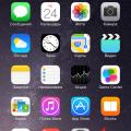 Простые варианты отключения вибрации на Айфоне